Inventing Interactive

Archived entries for

Augmented City

city2

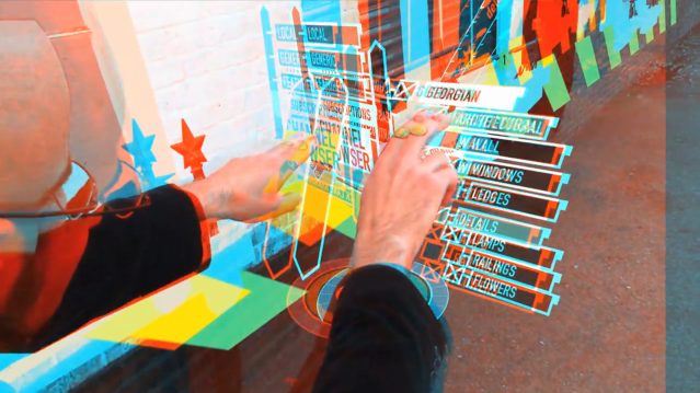
Get your 3D glasses back out — there’s more red-blue goodness ahead! Keiichi Matsuda, who created Domestic Robocop, has a new project: Augmented City. The architecture of the contemporary city is no longer simply about the physical space of buildings and landscape, more and more it is about the synthetic spaces created by the digital information that we collect, consume and organize; an immersive interface may become as much part of the world we inhabit…
 
Read the rest…

Slowing Down

obliquestratiphone

There’s been a lot of press over the past month or two about the possible dangers of multitasking, and how it can hurt our ability to focus and remember. But it was only last night, driving home from work, and not distracted by all the other web pages fighting for my attention, that I really “got” the story. Listening to this interview with Matt Richtel, the journalist who has been reporting this topic for the…
 
Read the rest…

BBVA ATMs

bbva_5

Redesigning the ATM experience is a recurring UI design favorite. They’re something we all use, and we all have thoughts about how they can be made better. A couple years ago, Physical Interface published an in-depth article about Pentagram’s redesign of the Wells Fargo ATM. It was a fascinating view into a very challenging task — revealing a lot of complex, and often conflicting, requirements. Unfortunately, most ATMs seem to end up as Frankenstein-like solutions…
 
Read the rest…

3D Everywhere!

Barneys Co-op

Yesterday I received a Barneys Co-op catalog in the mail — in which all of the photos were shot in 3D. Because they used the red-blue anaglyph method, they also included a pair of glasses. It may be an old-fashioned technology for 3D, but it’s still pretty fun. (You can also see the 3D catalog on their website.) So, I figured it was a sign for me to post some of the 3D links I’ve been…
 
Read the rest…

Inkling

inkling_notes

Just released for the iPad, Inkling looks fantastic. It’s designed as an e-textbook reader — and has beautiful layout and typography. It’s also got support for a wide range of multimedia content such as movies, 3D, and quizzes. But I think its real killer-feature is the way it can integrate your social network into the reading experience. You can embed notes within the pages, share them with others, even follow them as streams. It makes…
 
Read the rest…

How Big Really?

dimensions01

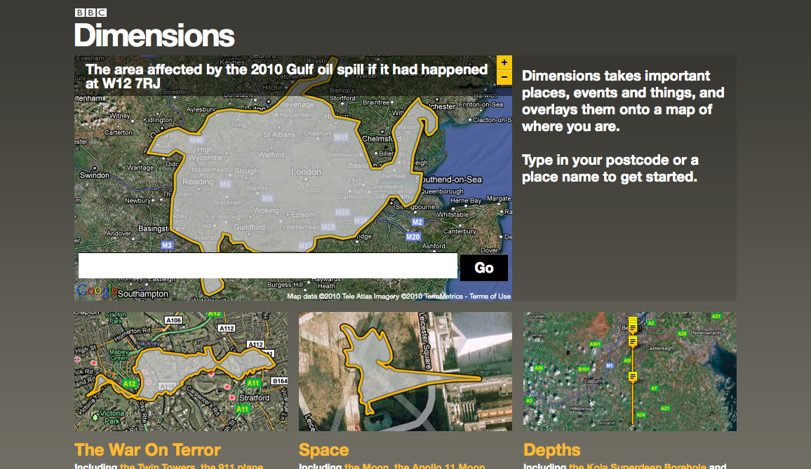
One of my favorite strange-but-fascinating infographics is the overlay of the Apollo 11 moon walks onto a baseball diamond. It presents something that’s so otherworldly and distant (a moon walk) into a super-familiar environment (a baseball diamond) to make the information immediately relevant and understandable. The image, created in 2009 by Thomas Schwagmeier is part of NASA’s Apollo 11 Image Library, where there are loads of other interesting overlays — such as this view of…
 
Read the rest…

Small Experiences

Entry #292

Creating a rich experience, with as little code as possible, is challenging. But the results can be marvels of creative programming. Remember, when back in 1996, using just 12k of code, Red Sky created HP Pong — the first interactive banner ad. There are two contests currently running to find the best small-sized web applications. The first, 10K Apart, is open through August 25. The challenge is to build a web app in less than…
 
Read the rest…

Chrome Experiments

chrome_experiments

I love Processing – but are its days numbered? What about Flash? A year ago, nobody would’ve seriously asked these questions — but times are changing fast. For years, Flash, and then Processing, were the tools-of-choice that designers used to explore and experiment with interactive media. But now, as the web’s focus moves to open standards, the most vibrant communities are those building around standards such as HTML5 and JavaScript. Take a look at jsdo.it…
 
Read the rest…

Music Notation and Play

flourish_03

Eye magazine published a fascinating article in 1997, Sound, Code, Image, on how graphic scores can “liberate” music from the five-line grid of traditional music notation. It looked at the work of composers from the 50′s to the 70′s, and their experiments at making musical scores more graphic and expressive. (And just today the Eye Blog did a post on John Cage’s watercolors and drawings.) The range of expressions that emerged from that era were…
 
Read the rest…

Reading Room 2020

reading_01

Recently Philips Design published a report on people focused innovation. It’s a interesting document that not only talks about how they use qualitative research and design thinking, but also shows a wide range of resulting solutions for the healthcare market. And some of the proposals are pretty cool — from ambient environments to a kitten scanner (!). The most interactive of the projects is the “Reading Room 2020″ — originally shown at the 2007 Radiological…
 
Read the rest…


 Home.   RSS Feed.    @i_interactive on Twitter. This blog is powered by Wordpress. The theme is based on Modern Clix. The "ii" logo is by TDOOKK.